Tafawaq
View live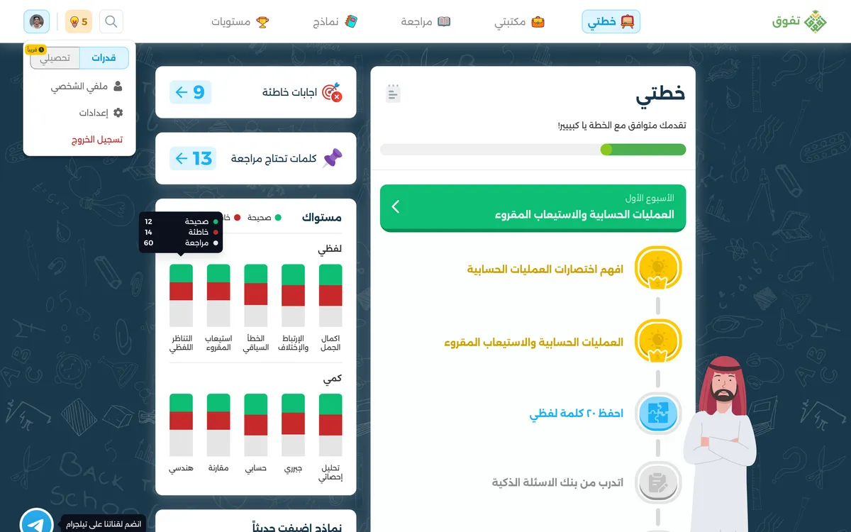
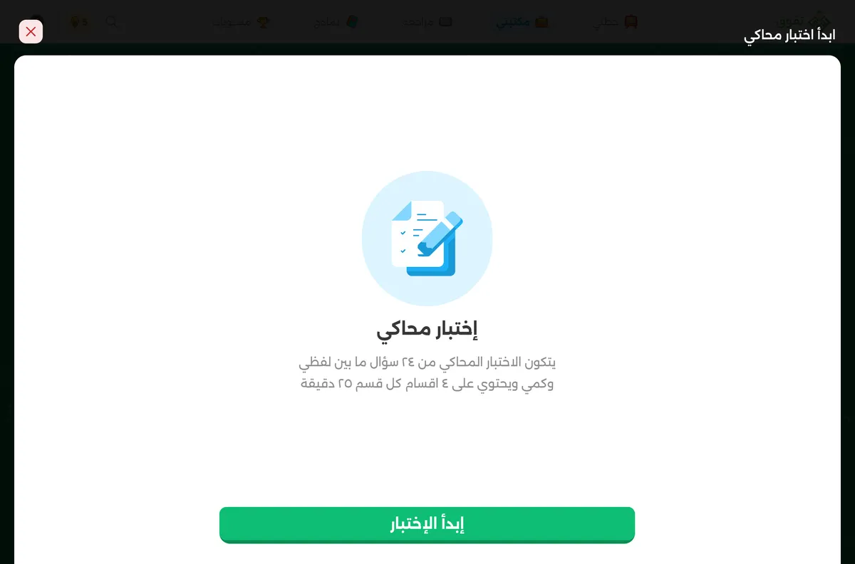
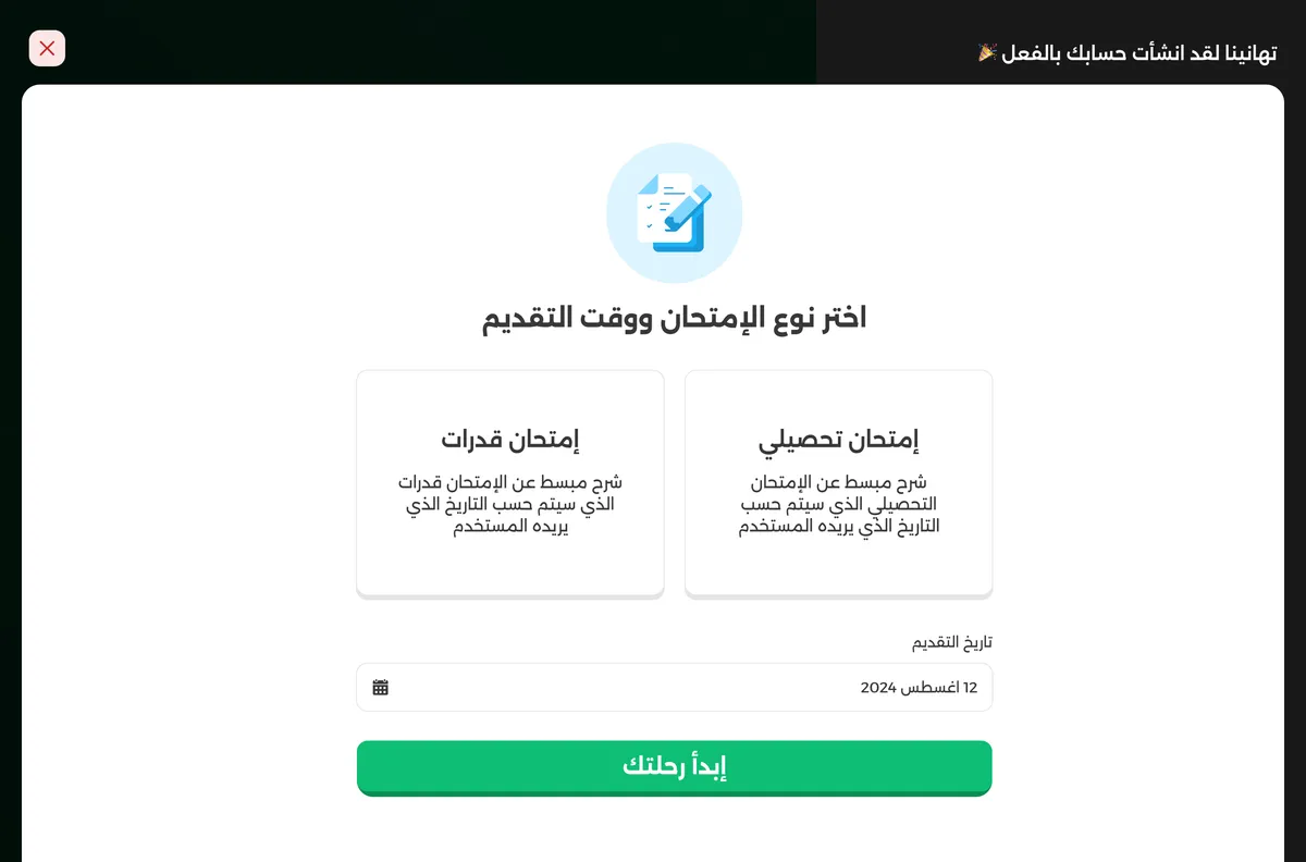
Tafawaq prepares Saudi secondary students for the Qudrat and Tahsili exams: study plans, a question bank, mock exams and revision. The mobile app already had an audience and a look students recognised. The web version was the gap.
I joined as UI designer. Two others owned product and UX; my job was the interface, taking an established mobile design language and making it work at 1440px without it feeling like a stretched phone screen.
Scaling up is not the same as designing for desktop
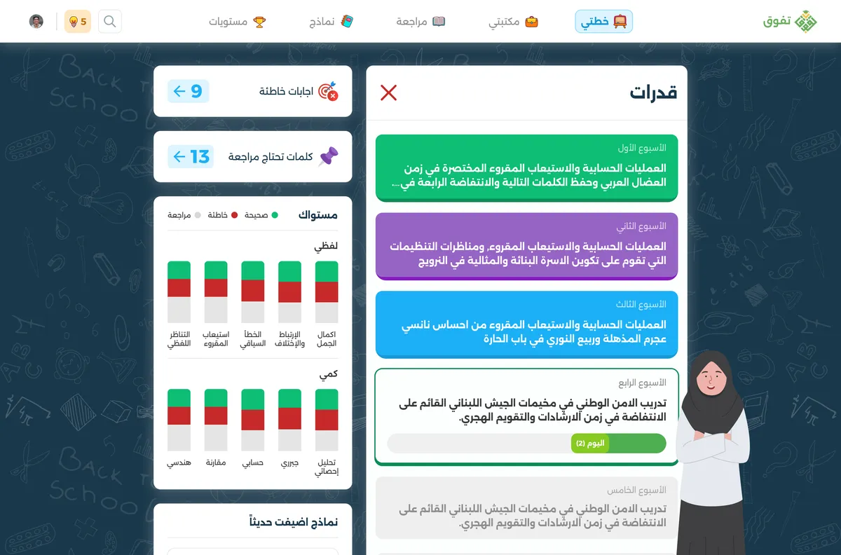
A phone screen shows one thing at a time and hides the rest behind navigation. A desktop screen is judged on how much it can show at once without becoming noise. The study plan is the clearest case: on mobile it is a vertical list you scroll, and on web it became a two-column view with the plan timeline on one side and progress, weak areas and recent mocks on the other. Same information, different job.
Keeping the personality

Test prep is not neutral territory. Students associate the product with its illustrations, its badge milestones, its colour and its patterned background, and stripping that out for a cleaner desktop look would have made it a different product. I kept the character and gave it room: the same illustrated tone, the same green and gold, on a layout that finally had space to breathe.
Arabic at desktop width
The interface is Arabic and fully right-to-left. Line length is a real constraint here, since Arabic set across a wide desktop column is tiring to read. Content sits in bounded cards and columns rather than spanning the full width, with Western numerals in scores and counts so figures stay scannable inside Arabic text.
Consistency as the deliverable
With a design system built for a phone, the desktop work was mostly deciding what each component becomes when it has more room: which cards get denser, which stay fixed, which grow. Getting that set of rules right was the actual deliverable, more than any single screen.